
How to Design an App Icon and Screenshots
Master critical steps for crafting impactful app icons and compelling screenshots. Learn design principles for visibility, branding, and conversion across app stores.

ON THIS PAGE
0% read
- The Critical Role of App Icons and Screenshots in App Store Success
- Designing Your App Icon: Principles for Standout Visibility
- Crafting Compelling App Store Screenshots for Conversion
- Integrating Icon and Screenshot Design for Maximum ASO Impact
- Essential Tools and Resources for App Icon and Screenshot Design
- Continuous Improvement: Testing, Analytics, and Updates
- Final Thoughts: Your Visual Strategy for App Store Dominance
Designing high-performing visual assets is a foundational requirement for securing sustained user acquisition in highly saturated application marketplaces. Knowing how to design an app icon and screenshots requires navigating a complex intersection of platform technical specifications, human cognitive biases, and conversion rate optimization (ASO/CRO) principles. This technical manual details the exact processes, dimensional parameters, design workflows, and psychological triggers required to produce assets that convert browsing traffic into active downloads across both the Apple App Store and Google Play Store ecosystems. By studying these steps, product managers, developers, and business stakeholders will acquire actionable methodologies to design, test, and optimize their app's primary visual touchpoints.
The Critical Role of App Icons and Screenshots in App Store Success

First Impressions and User Perception
The human visual cortex processes images far faster than textual descriptions. When a user queries a keyword on an app store, they do not initially read the long-form description or even the bulleted list of features. Instead, their eyes scan a grid of search results, resting briefly on the app icon and the first few visible screenshots. Within this split-second window, known as the "first-impression frame," cognitive biases like the aesthetic-usability effect dictate the user’s next move. If the visual assets appear unpolished, disorganized, or generic, users immediately associate those visual shortcomings with the underlying code, assuming the application itself is unstable, poorly engineered, or insecure.
To design an app icon that commands attention, product teams must balance aesthetic elegance with functional clarity. The icon serves as the digital storefront. It must communicate the core utility of the product—whether it is a secure B2B SaaS platform or a streamlined e-commerce tool—through a singular, recognizable graphic. Meanwhile, the screenshots must continue this visual narrative by instantly answering the user's primary pain points. If this narrative is fragmented, cognitive load increases, prompting the user to scroll past and download a competitor's offering.
Driving Discoverability and Downloads (ASO Perspective)
App Store Optimization (ASO) is often equated with metadata optimization, such as integrating high-volume keywords into the title, subtitle, and description fields. However, visual assets are the ultimate engine of search algorithms. While textual keyword integration determines the indexation of your app page, your click-through rate (CTR) and overall conversion rate (CVR) tell store algorithms whether your application is actually relevant to those search queries. If your app ranks for a highly valuable term but fails to generate clicks due to a poorly designed icon or uninspiring screenshots, the algorithm will systematically demote your listing over time.
Apple’s App Store and Google’s Play Store reward conversion efficiency. When an application maintains a high download-to-view ratio, it Signals to the algorithmic ranking systems that the app satisfies user search intent. Consequently, improving your visual assets directly improves your organic positioning. Furthermore, high-quality visuals are essential for getting featured in curated editorial collections, such as Apple's "App of the Day" or Google's "Editors' Choice" selections. These editorial placements, which can boost installation volumes by multiple orders of magnitude, are strictly gated by visual design standards.
Building Brand Identity and Trust
In an era of rising cybersecurity threats, data privacy concerns, and predatory subscription models, trust is the currency of the app ecosystem. A professionally engineered visual suite acts as a seal of credibility. It signals to enterprises and individual consumers alike that your product is backed by a legitimate organization committed to quality. Consistency in color theory, typography, and imagery across your icon, screenshots, and in-app user interface builds a cohesive brand architecture that reassures users during the critical moment before clicking "Install."
This visual consistency must also extend beyond the app store listing. When a user downloads your app, the icon they saw in the store is placed on their home screen. It becomes a permanent part of their daily digital environment. A well-designed icon ensures that every time a user glances at their device, your brand recognition is reinforced. Over time, this constant, friction-free exposure transforms transient trial users into loyal, high-lifetime-value (LTV) customers, reducing churn and lowering long-term user acquisition costs.
---
Designing Your App Icon: Principles for Standout Visibility
Understanding App Store Guidelines and Requirements
Before drafting any vector paths, design teams must understand the strict, platform-specific technical parameters mandated by Apple and Google. Neglecting these rules results in automated rejection during the submission process or bad asset rendering on user devices. Apple's Human Interface Guidelines (HIG) and Google's Material Design documentation detail precise dimensions, color profiles, and safe areas that must be adhered to.
For iOS platforms, icons are rendered dynamically with a standard rounded corner mask applied by the operating system. Designers must never submit assets with pre-rounded corners; instead, icons should be provided as flat, square PNG files. The universal standard size for submission is 1024x1024 pixels at 72 PPI (pixels per inch), which Apple downsamples for various screen densities (such as @2x and @3x assets for Super Retina displays).
Google Play utilizes adaptive icons, which require separating the icon into two distinct layers: a foreground vector or raster asset and a background layer. This separation allows the Android system to apply dynamic visual effects, such as parallax scrolling, squircle masking, and physics-based animations. Adaptive icon layers must be sized at 512x512 pixels, with the essential visual elements kept within a "safe zone" circle of 264 pixels in diameter to ensure no content is clipped when different device manufacturers apply custom mask shapes.
Core Design Principles for Effective App Icons
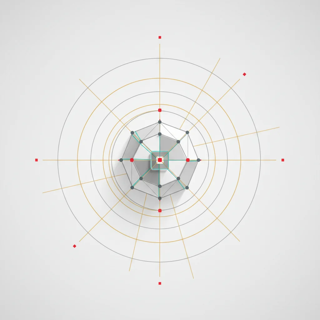
An icon must remain highly legible when scaled down to a minute 29x29 pixel setting inside a device's nested settings menu or a search auto-complete dropdown. Achieving this scalable clarity requires radical simplicity. Designers should focus on a single, compelling focal point—whether it is a simplified brand mark, a stylized letterform, or an abstract representation of the core feature. Trying to fit complex scenes, multiple characters, or realistic photos into an icon ruins its legibility at small sizes.
Color theory is another critical pillar of icon visibility. The color scheme must offer high contrast against both light and dark system backgrounds, as well as various user wallpapers. Utilizing a limited palette of two to three complementary or analogous colors ensures visual cohesion. Additionally, designers should minimize fine, intricate line work and heavy skeuomorphic drop shadows. Instead, rely on bold geometry, solid shapes, and subtle gradients to create depth without introducing visual noise.
+-------------------------------------------------------------+
|               APP ICON VISIBILITY BLUEPRINT                 |
+-------------------------------------------------------------+
|  [Simplicity]        -> Single focal point, no complex details|
|  [Legibility]        -> Tested at 1024x1024 down to 29x29px  |
|  [Color Contrast]    -> High contrast on both light/dark modes |
|  [Zero Text]         -> Never use words or UI interface parts |
|  [Platform Rules]    -> iOS Square PNGs vs. Android Adaptive  |
+-------------------------------------------------------------+
The Iterative App Icon Design Process
Creating a top-tier icon is an iterative journey that transitions from loose conceptualization to pixel-perfect execution. The process begins with divergent brainstorming sessions where the design team explores diverse metaphors that align with the brand’s core utility. Sketches should be done in monochrome first to ensure the core silhouette is recognizable and structurally sound before the introduction of color vectors.
Once a selection of three to five strong monochrome concepts is approved, the design team translates them into digital vectors using tools like Figma or Adobe Illustrator. During this phase, applying a structured design grid—such as the standard iOS grid system—helps align key architectural intersections, ensuring geometric harmony.
Next, the vector is exported to realistic mockups. The design should be viewed inside simulated home screens, system search results, notification banners, and app store listings next to direct market competitors. This context-based evaluation reveals subtle visual imbalances, legibility issues, or competitive overlap that is impossible to detect when viewing the asset on a blank canvas.
Common Pitfalls and How to Avoid Them in Icon Design
The most frequent error in icon design is the inclusion of text or secondary branding words. Because the app name is already displayed immediately adjacent to the icon in search listings and on the home screen, placing text inside the graphic frame is redundant. Furthermore, text scales poorly, turning into illegible visual clutter at smaller screen dimensions.
Another common pitfall is the literal copy-pasting of in-app UI components, such as screenshots or actual button elements, directly into the icon. This practice displays a lack of design effort and fails to create a unique brand mark.
Finally, do not rely on trendy visual styles that age rapidly. While glassmorphism, hyper-realistic 3D rendering, or flat-neon trends may look appealing today, they can quickly become dated. A classic, geometrically balanced icon anchored in functional minimalism will remain relevant for years, reducing the need for disruptive, costly rebranding campaigns.
---
Crafting Compelling App Store Screenshots for Conversion
Strategic Planning for App Screenshots
App store screenshots are not merely random captures of your app’s interface; they are sequential marketing banners designed to lead users through a structured conversion funnel. Before drafting a single frame, product teams must identify their app's top three to five value propositions. These core features should align directly with user search intent. For example, if your app is a high-security fintech tool, your primary screens must highlight instant transfers, bank-grade encryption, and real-time balance tracking.
The sequence of your screenshots is critical. On search result pages, both iOS and Android display the first one to three screenshots (depending on orientation). This means your very first screenshot must act as an irresistible hook. It should present your absolute strongest selling point in a visually dominant format. Subsequent screens can then go into secondary features, such as account setup speed, integration ecosystems, or support channels. This structural flow guides the user from curiosity to final installation.
App Store Requirements and Best Practices
Both major app stores enforce rigorous technical requirements regarding screenshot dimensions, file formats, and permissible content. Failing to submit the correct resolutions for target devices will prevent your update from going live.
On the iOS App Store, you must provide screenshots tailored for different device families. The most critical dimensions include the 6.9-inch display (iPhone 16 Pro Max / 15 Pro Max) at 1320x2868 pixels and the 6.5-inch display (iPhone XS Max / 11 Pro Max) at 1242x2688 pixels. For iPad-compatible applications, separate 12.9-inch assets at 2048x2732 pixels are mandatory. Apple allows up to 10 screenshots per listing, supporting JPEG or PNG formats without transparency.
Google Play simplifies this pipeline by accepting a wide range of aspect ratios and dynamic scaling, though they recommend a standard 16:9 or 9:16 format. Google requires at least four screenshots, with minimum dimensions of 1080x1920 pixels for portrait or 1920x1080 pixels for landscape. Google also has a strict policy requiring that screenshots represent the actual in-app experience. Excessive promotional text, abstract marketing visuals, or pictures that do not resemble the real user interface can lead to policy warnings or rejection during store review.
+-------------------------------------------------------------+
|             RECOMMENDED SCREENSHOT SEQUENCE                 |
+-------------------------------------------------------------+
| Screen 1: The Hook       -> Absolute core value proposition |
| Screen 2: Primary Feature -> Real-time actions/UI interaction|
| Screen 3: Social Proof    -> Security badge, rating, or award|
| Screen 4: Depth & Utility -> Secondary features / Integrations|
| Screen 5: Clear Call-to-Action -> "Join 1M+ Users Today"    |
+-------------------------------------------------------------+
Design Elements for Maximizing Screenshot Impact
To ensure screenshots convert, designers must use clean visual hierarchies. One of the most effective approaches is the "device-frame-and-caption" layout. By placing a simplified vector mockup of a modern phone within the screenshot frame, you focus the user's eye on the app's interface while maintaining a clean, professional border for explanatory text. The device frame must be updated regularly to reflect current hardware trends; utilizing outdated phone designs with thick bezels immediately dates your application.
Typography on screenshots must be large, bold, and highly readable. Store visitors browse listings quickly, so caption text should be limited to five to seven words per screen. Use high-contrast fonts that stand out against the background color. Additionally, applying a selective blur or using high-contrast highlight overlays on the interface mockups can draw the user's attention directly to specific UI components, such as a successful transaction notification or a completed task checkbox, preventing the viewer from being overwhelmed by complex dashboard elements.
Leveraging Video Previews and Promotional Text
To complement static screenshots, integrating an App Preview (iOS) or a Promo Video (Android) can significantly improve conversion rates. A video preview acts as an interactive elevator pitch, showing the actual speed and responsiveness of the application. Apple allows up to three 30-second App Previews, which must consist almost entirely of captured in-app footage. Google Play uses YouTube-hosted landscape videos that are displayed before the screenshot gallery, making them excellent for broader storytelling and brand positioning.
When utilizing video previews, keep in mind that many users browse the store with their devices muted. This means any spoken voiceover must be supported by clear, on-screen text overlays. The first five seconds of the video are the most critical; if the intro is slow or focuses on an animated company logo, viewers will swipe away. Start with high-impact, real-time in-app actions, and conclude with a direct call-to-action (CTA) that encourages the user to download.
Step-by-step methodology for executing high-converting screenshot assets. Analyze user search queries and identify the top 5 key features that solve immediate pain points. Prepare clean, high-resolution screens of the application interface, replacing dummy data with realistic, professional user records. Place the UI screens into modern, borderless device mockups and overlay bold, legible caption text using your brand’s typography. Export the finalized assets into all required resolutions for Apple and Google platforms, translating all caption text into your target market languages.App Store Screenshot Creation Workflow
Define Core Value Propositions
Draft High-Fidelity UI Screens
Design Layouts and Typography
Scale and Localize
---
Integrating Icon and Screenshot Design for Maximum ASO Impact

Brand Cohesion Across All Visuals
A disjointed app store listing is a silent conversion killer. If a user clicks on an elegant, minimalist app icon only to find a screenshot gallery filled with chaotic neon gradients, clashing fonts, and low-resolution mockups, the sudden shift in design quality creates immediate friction. Establishing brand cohesion across all visual assets is not just about looks; it is a critical optimization strategy that reassures the user they are dealing with a professional, unified product.
To achieve this cohesion, design teams should establish a strict, shared style guide before starting the creative process. This guide must define the brand's primary and secondary color palettes, font pairings, iconographies, and photography guidelines. For instance, if your icon uses a modern sans-serif font paired with deep slate and emerald colors, those exact typographic and color systems must be applied to the screenshot captions and background patterns. This unified presentation creates a consistent visual narrative that makes your app's value proposition easy to digest.
                  UNIFIED DESIGN LANGUAGE FLOW

   +-------------------------------------------------------+
   |                       BRAND GUIDE                     |
   |   - Slate Blue (#1C2D42)    - Emerald (#10B981)       |
   |   - Inter Font Family       - Rounded Geometric Icons |
   +-------------------------------------------------------+
                              |
            +-----------------+-----------------+
            |                                   |
            v                                   v
   +------------------+                +------------------+
   |    APP ICON      |                |    SCREENSHOTS   |
   |  Minimalist shape|                |  Matching fonts  |
   |  Emerald asset   |                |  Slate backdrops |
   |  No text elements|                |  Cohesive frames |
   +------------------+                +------------------+
Optimizing the User Journey from Browse to Download
The user's interaction with your app store listing is a sequential journey, not a single event. When browsing search results, the user sees your app icon, your title, and the first few screenshots. This initial view is the "browse-to-click" phase, where the main goal is to stand out from surrounding listings. Once the user clicks through to your full page, they enter the "detail-to-conversion" phase. Here, they can scroll through the entire screenshot gallery, read reviews, and check technical specifications.
Designing for this journey requires a balanced approach. While the app icon must be bold and highly visible to win the initial click, the screenshots must provide deeper context to secure the final installation. If your screenshots simply repeat the visual style of the icon without adding functional details, they fail to move the user further down the conversion funnel. Every screenshot must build on the initial promise of the icon, offering a logical next step that guides the user toward clicking the install button.
---
Essential Tools and Resources for App Icon and Screenshot Design

Design Software
Creating high-performing visual assets requires professional-grade design software that supports precise vector creation, flexible grid layouts, and automated export workflows. For most product teams, Figma has become the industry standard. Its cloud-based, collaborative environment allows designers, copywriters, and developers to work on icons and screenshots in real-time. Figma's robust auto-layout feature is particularly valuable for designing screenshots, as it allows captions and device frames to resize dynamically across different screen dimensions.
For complex graphic asset creation, Adobe Illustrator and Photoshop remain essential tools in a designer's workflow. Illustrator's advanced vector engine is perfect for drafting and refining the geometric shapes of an app icon. It ensures that the final design can be scaled to any size without losing crispness. Photoshop is often used for high-fidelity photo editing, custom shadow work, and advanced rendering of user interface highlights. Using these tools together allows teams to create highly polished, professional assets that stand out in crowded stores.
Icon Generators and Templates
Manually resizing an app icon into the dozens of configurations required for various device targets (such as notification badges, settings screens, and home screen sizes) is slow and prone to errors. To save time and maintain quality, professional design teams rely on automated icon generators and pre-built templates. These tools streamline the production process, letting designers focus on the creative work rather than repetitive technical tasks.
Figma plugins like "App Icon Generator" or web-based tools like "App Icon Maker" can take a single 1024x1024 vector file and instantly generate all the necessary sizes for iOS and Android platforms. Additionally, utilizing official design templates provided directly by Apple and Google ensures that your icon layout aligns perfectly with system-level grids. This helps keep your visual design consistent with the core look and feel of the device operating systems.
App Mockup Generators
Building device frames from scratch can be time-consuming. Fortunately, there are several specialized app mockup generators that can streamline this step. Tools like Rotato, Previewed.app, and Placeit offer library access to high-fidelity, 3D-rendered device frames that can be customized with your app's screenshots. These platforms allow you to adjust camera angles, lighting reflection, and background colors, helping you create dynamic, professional presentations that look great on any store listing.
For teams that prefer a hand-on approach inside Figma, using community-created device UI kits (such as those from UI8 or official developer design templates) provides a clean starting point. These kits contain pre-built vector models of the latest iPhone and Android devices. This makes it easy to drop in your app screenshots while maintaining full control over colors, framing, and text layout, without having to rely on external platforms.
A/B Testing Platforms
Design decisions should never be based purely on subjective opinions or internal team preferences. What appeals to your design team might not resonate with your target audience. To truly optimize your app's visual assets, you must rely on objective performance data. A/B testing platforms allow you to compare different design variants in real-world environments, helping you identify which visual elements drive the highest conversion rates.
Platforms like SplitMetrics, Storemaven, and Google Play Console's built-in Store Listing Experiments allow you to test variations of your app icon, screenshots, and video previews with real users. These platforms track key performance metrics, such as click-through rates and installation conversions, giving you the actionable insights needed to continuously refine your store presence.
---
Continuous Improvement: Testing, Analytics, and Updates

Monitoring Performance Metrics
Designing your app store assets is not a one-time project. It is a continuous, data-driven process that requires regular monitoring and optimization. Once your new icon and screenshots are live, you need to track how they affect your listing's performance. Both App Store Connect and Google Play Console provide rich analytics dashboards that allow you to monitor key user acquisition metrics.
The primary metric to monitor is the conversion rate, which measures the percentage of users who install your app after visiting your listing. You should also pay close attention to your impression-to-download ratio and your organic search traffic trends. A sudden dip in these metrics after an update can signal that your new visuals are not resonating with your audience. This indicates that it may be time to pivot your creative strategy and try a different approach.
+-------------------------------------------------------------+
|             KEY PERFORMANCE METRIC FORMULAS                 |
+-------------------------------------------------------------+
|  Click-Through Rate (CTR)   = (Store Clicks / Impressions)  |
|  Conversion Rate (CVR)      = (App Downloads / Page Views)  |
|  Acquisition Cost (CAC)     = (Marketing Spend / Downloads) |
|  Organic Multiplier         = (Organic Installs / Paid)    |
+-------------------------------------------------------------+
Iterative Design Based on User Feedback and Market Trends
The app marketplace is constantly changing, with new design trends, feature updates, and competitor strategies emerging regularly. To maintain a strong store presence, your visual assets must evolve alongside these shifts. Regularly audit your direct competitors' listings to identify common themes, color schemes, and messaging patterns. This analysis can help you find opportunities to differentiate your app and stand out from the crowd.
In addition to competitive analysis, look to your user feedback for design inspiration. Customer reviews, support inquiries, and user onboarding surveys can reveal your app's most popular features and common pain points. If a large portion of your user base praises your app's offline functionality or ease of integration, those key value propositions should be prominently featured in your primary screenshots. By continuously aligning your visual messaging with real user experiences, you ensure your store listing remains highly relevant and engaging.
---
Final Thoughts: Your Visual Strategy for App Store Dominance

Crafting a high-converting app store presence is a continuous journey that requires a balance of creative vision and analytical rigor. By mastering the core principles of app icon and screenshot design—from understanding platform-specific technical guidelines to implementing cohesive visual storytelling—you can build a professional, trustworthy listing that stands out from the competition.
However, design is never static. To maintain a strong market position, product teams must adopt a culture of continuous optimization. By regularly testing new visual variations, analyzing performance metrics, and updating assets based on real user feedback, you ensure your store listing remains a highly efficient acquisition engine. Investing the time and resources to build a cohesive, data-driven visual strategy is a critical step toward achieving long-term growth and success in the app marketplace.
---
Frequently Asked Questions
What is the required resolution for iOS app icons in App Store Connect?
The standard requirement is a flat, square PNG file sized at 1024x1024 pixels, utilizing the sRGB or Display P3 color space, and containing no alpha transparency or rounded corners.
Can I use the same screenshots for both iOS and Android stores?
While some visual elements can be shared, you must adapt your screenshots to meet the specific resolution, aspect ratio, and framing guidelines required by each platform's ingestion pipeline.
How many screenshots should I include in my store listing?
While Apple allows up to 10 screenshots and Google allows up to 8, you should focus on the quality of your first 3 to 5 screens, as they are the primary drivers of user conversions.
Is it better to use portrait or landscape screenshots?
Portrait screenshots are generally preferred for most utility, social, and e-commerce apps because they display more frames simultaneously on mobile search results, whereas landscape screenshots are best suited for games and media players.
Should I place actual device borders around my screenshots?
Yes, using modern, borderless device mockups helps contextualize your application's user interface, but you must update these frames regularly to ensure they reflect current mobile hardware designs.
How often should I update my app icon and screenshots?
You should review your store visuals at least once every quarter, or whenever you release major feature updates, notice a decline in conversion rates, or observe significant shifts in competitor designs.
Does Google Play require real in-app screenshots?
Yes, Google Play policies strictly mandate that your screenshots represent the actual, current in-app user experience rather than abstract marketing illustrations or unrelated graphics.
How do I measure if my new visual assets are performing well?
Monitor key performance metrics like conversion rate, click-through rate, and organic download trends in your App Store Connect or Google Play Console dashboards before and after implementing design changes.