
What Is a Grid System in Web Design?
A grid system in web design provides a structural framework using rows and columns to organize content consistently. It ensures visual hierarchy, supports responsive layouts, and improves user experience across all devices.

ON THIS PAGE
0% read
- The Foundational Principles: Defining a Grid System
- Why Grid Systems Are Indispensable for Modern Web Design
- Understanding the Different Types of Grid Systems
- Practical Implementation: Tools and Approaches for Web Grids
- Best Practices and Caution-Aware Considerations for Grid Usage
- Real-World Examples: Grids in Action
- Conclusion: Embracing Structured Design for a Better Web
In modern software development, a cohesive visual layout is essential for ensuring both brand equity and technical scalability. What Is a Grid System in Web Design? At its core, a grid system is a structured mathematical framework composed of intersecting horizontal and vertical axes—columns, rows, gutters, and margins—designed to organize user interface (UI) components systematically. By establishing a predictable layout flow, grid systems safeguard visual hierarchy, facilitate seamless responsive design across multiple viewport thresholds, and dramatically improve user experience (UX). For engineering teams and design stakeholders, implementing a disciplined grid strategy directly mitigates Cumulative Layout Shift (CLS) and accelerates front-end deployment cycles.
The Foundational Principles: Defining a Grid System
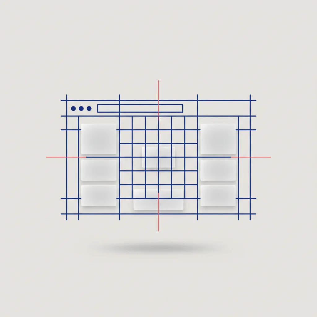
What Exactly Constitutes a Grid System in Web Design?
In the discipline of digital design, a grid system is not a decorative overlay but an architectural blueprint. It divides the canvas into precise zones, enabling designers and front-end developers to manage negative space with mathematical accuracy. Historically derived from typography and print layout methods popularized by mid-20th-century Swiss designers, the grid has evolved from static ink grids to highly dynamic digital responsive matrices. It functions as the hidden lattice that keeps design elements locked into a predictable visual order.
Rather than positioning elements arbitrarily, a grid mandates that every card, image, text block, and call-to-action (CTA) aligns to an underlying visual rhythm. This structured approach directly lowers the cognitive processing required by the human brain to decipher a layout. When a user lands on a webpage, their visual tracking relies on predictable spatial cues. An established grid makes these patterns intuitive, leading directly to higher task success rates and longer average session durations.
On a technical level, a grid system establishes a unified visual vocabulary. When engineering and design departments share an identical spatial scale, communication overhead drops significantly. Developers do not need to guess relative spacing or calculate unique pixel offsets for every UI component. Instead, they can reference a predefined mathematical framework, transforming design layouts into maintainable, standards-compliant code.
Key Components That Make Up a Web Design Grid
Understanding the anatomy of a grid is essential for implementing layouts that remain unbroken across varied viewport environments. A standard web layout grid consists of several overlapping variables, each playing a specific role in keeping design elements organized:
Columns: The vertical bands that span from the left edge of a container to the right. The standard industry desktop grid features 12 columns. This specific configuration is favored because 12 is highly divisible (by 2, 3, 4, and 6), which gives developers the freedom to build diverse column spans without breaking the master alignment.
Rows: The horizontal bands that cross the page from left to right. While columns regulate horizontal alignment, rows control vertical pacing. In web environments, row heights are often dynamic, expanding and shrinking depending on the content length.
Gutters: The spaces that run between columns and rows. Gutters prevent visual elements from colliding with one another, providing breathing room. Standard gutter widths range from 16px to 24px on desktop devices, scaling down to 8px or 12px on mobile environments to protect screen space.
Margins: The negative space situated between the physical screen boundaries and the main content container. Margins keep the text from running into the literal edge of a phone or monitor, ensuring a comfortable reading experience.
Grid Cells: The individual units created by the intersection of a single column and a single row. This represents the basic building block of any grid layout.
Modules: Spatial clusters created by combining multiple adjacent grid cells. Modules are typically assigned to house individual interface components, such as a contact form, a visual hero banner, or an editorial article card.
Maintaining a strict mathematical relationship between these elements is what guarantees visual harmony. Modern UI platforms like Figma allow designers to define layout grids natively, matching the precise padding and column properties of CSS frameworks.
Why Grid Systems Are Indispensable for Modern Web Design
Ensuring Visual Consistency and Brand Identity
Visual consistency is the absolute foundation of corporate brand equity. When a user moves from an informational home screen to an interactive checkout flow, any layout shift or inconsistent margin immediately signals poor craftsmanship and erodes trust. Grid systems serve as the single source of truth for visual alignment. By defining consistent spacing values (such as an 8-pixel grid standard), brand experiences remain completely uniform regardless of which team member developed the page.
Moreover, consistency in design reduces cognitive friction. Users do not have to waste cognitive bandwidth adapting to new spatial paradigms as they click through a site. When headers, logos, navigation bars, and copy lines line up precisely, the entire digital product conveys an elite level of polish and attention to detail. This systematic alignment validates the brand's commitment to quality, reinforcing market positioning without requiring a single line of text.
Establishing Clear Visual Hierarchy and Readability
A visual hierarchy determines the order in which a visitor reads, processes, and acts upon information. Without a logical layout, eye tracking becomes erratic, leading to immediate site abandonment. Grids allow designers to manipulate visual scale mathematically. By allocating different column widths to different blocks, designers instantly signal the relative value of different information clusters.
For example, a high-value value proposition block might span 8 columns, while a secondary content widget occupies the remaining 4 columns. This distribution makes the primary focal point clear. Simultaneously, aligning the typographic baselines ensures that text blocks sitting side-by-side maintain perfect optical synchronization. This typographical discipline protects the reading flow, encouraging sustained attention and decreasing immediate page bounce rates.
Facilitating Seamless Responsive Design Across All Devices
Digital interfaces are viewed on a chaotic variety of physical viewports, from low-resolution mobile phone displays to wide 4K office monitors. Grid systems solve this fragmentation by organizing layouts into fluid, relative structures. Instead of building rigid, static pages, modern grids utilize relative units (such as percentages, fractions, and viewport units) along with CSS breakpoints to reflow elements dynamically.
At a breakpoint of 768px, a 12-column desktop grid can easily transform into a 4-column tablet grid, and then stack into a single-column layout on mobile viewports. By using this adaptive grid architecture, responsive design elements flow naturally into their assigned zones. Columns stretch or collapse, gutters adjust proportionally, and elements never overlap, preventing layout breaks on untested display widths.
Streamlining Development Workflow and Enhancing Collaboration
Designing without an underlying grid layout leads to highly disorganized handoffs between design and engineering. Without an established system, developers must manually inspect every pixel of padding, margin, and element width in a mockup, which often results in visual drift during production. When an engineering team utilizes a consistent CSS framework grid, they can translate designs into clean code within minutes using simple column spans (e.g., <div class="col-md-6 col-sm-12">).
This structure simplifies quality assurance (QA) processes and makes code maintenance far more straightforward. If a corporate layout needs a minor revision, a developer can change a single grid configuration variable, and the change will instantly distribute across every template page. The unified spatial language of a grid unites design teams and front-end engineers under one cohesive framework.
Elevating User Experience (UX) and Overall Usability
Optimal user experience relies entirely on visual predictability. If interactive elements (such as primary call-to-action buttons, search fields, and form controls) reside in predictable, mathematically balanced grid zones, users can accomplish their goals effortlessly. This usability is highly critical for complex e-commerce checkouts and data-heavy enterprise platforms, where minor user frustration directly translates into abandoned carts and lost revenue.
From a modern technical SEO perspective, using CSS layouts with predefined grid sizes helps minimize page rendering delays. Browsers can calculate layout structures much more efficiently, protecting critical performance metrics such as Cumulative Layout Shift (CLS) and Largest Contentful Paint (LCP). By maintaining clean grid coordinates in CSS, the layout rendering engine calculates element geometry before rendering, avoiding unexpected layout jumps during loading.
Understanding the Different Types of Grid Systems

Fixed Grids: The Legacy Approach
Fixed grids utilize concrete pixel values for container boundaries, columns, and gutters. For instance, a classic fixed layout might wrap all page contents in a 960-pixel container, featuring twelve 60-pixel columns spaced with 20-pixel gutters. This fixed structural methodology was the dominant layout pattern during the early desktop web era because it offered designers exact pixel-perfect control over how text and imagery rendered.
However, fixed-grid architecture is highly incompatible with the modern multi-device ecosystem. If a visitor opens a fixed 960px container on an older mobile device with a 320px viewport width, the layout is truncated, forcing the user to zoom and scroll horizontally to access content. On ultra-wide desktop monitors, fixed containers float in a massive sea of empty margin space, wasting valuable screen area. As a result, modern web development teams rarely implement purely fixed grids.
Fluid Grids: Embracing Flexibility
Fluid grids, also known as liquid layouts, replace rigid pixels with percentage-based proportions. The layout's columns, margins, and gutter sizes are calculated proportionally to the parent viewport. To determine a fluid column's percentage width, designers historically used the standard formula:
$$\text{Width \%} = \left( \frac{\text{Target Width}}{\text{Context Width}} \right) \times 100$$
Under this system, as the browser window stretches or contracts, the layout elements adjust dynamically.
Although fluid grids solve viewport scaling issues, they introduce distinct usability challenges. On wide monitors, text lines can stretch excessively, making paragraph blocks highly fatiguing to read. On mobile viewports, complex multi-column structures can shrink so severely that imagery loses its detail, and columns collapse into thin vertical columns. To maintain complete control, fluid systems must be combined with media queries to enforce boundaries at extreme sizes.
Responsive Grids: The Modern Standard
Responsive grids represent the modern industry standard for cross-device layout design. This approach combines the predictability of fixed containers with the flexibility of percentage-based fluid grids by using media queries. These media queries establish specific breakpoint thresholds (such as 640px, 768px, 1024px, and 1280px) where the underlying layout changes structure.
At small viewports, a responsive grid typically displays a single-column stack with 16px margins to ensure readability. As the viewport widens to tablet dimensions, the layout transforms into a 6-column system, and finally scales to a 12-column grid on desktop monitors. By defining boundaries and changing column allocations at key thresholds, responsive grids preserve structural alignment on every display size.
Adaptive Grids: A Strategic Alternative
While responsive grids scale fluidly between breakpoints, adaptive grids utilize static layout sizes that swap entirely based on the screen size detected. If the user's browser falls within a certain width range, the site displays a specific static layout template. The browser detects the display device and renders the exact grid variation built specifically for that size (e.g., standard desktop view, tablet view, or mobile view).
Developing adaptive layouts can sometimes require maintaining multiple distinct codebases, which increases engineering overhead. However, adaptive grids are a strategic choice for complex enterprise portals or legacy systems where refactoring a dense desktop interface into a fluid responsive grid is technically impractical. They provide complete structural control over individual device views, allowing designers to optimize highly complex transactional systems.
Evaluating layout frameworks based on viewport adaptivity, maintenance complexity, and user experience. Avantaj Easiest to design and develop because of constant pixel values; ensures exact visual reproduction. Dezavantaj Highly incompatible with mobile viewports; causes severe layout breakage and horizontal scrolling. Avantaj Adapts continuously to any viewport width without breaking the container flow. Dezavantaj Typographical line lengths can stretch excessively, degrading readability on modern wide screens. Avantaj Offers precise layout adjustments at defined breakpoints; ideal for modern cross-platform optimization. Dezavantaj Requires advanced planning, media query configuration, and thorough viewport testing. Avantaj Highly customized, static layout presentation tailored specifically for detected devices. Dezavantaj Increases development overhead and complexity due to maintaining multiple layout templates.Grid Type Decision Matrix
Fixed Grids
Fluid Grids
Responsive Grids
Adaptive Grids
Practical Implementation: Tools and Approaches for Web Grids
Leveraging CSS Grid Layout: The Powerhouse of 2D Grids
The native W3C CSS Grid Layout module is a powerful, native two-dimensional layout engine built specifically for modern browser environments. Unlike older front-end hacks that relied on table tags or CSS float properties, CSS Grid manages both columns (horizontal tracks) and rows (vertical tracks) simultaneously. This absolute control allows developers to build asymmetrical, overlapping layouts that remain highly stable under heavy content updates.
An exceptional benefit of CSS Grid is its declarative syntax, which allows developers to build highly complex parent containers without needing margins or paddings on child items:
.main-dashboard {
  display: grid;
  grid-template-columns: repeat(12, 1fr);
  grid-template-rows: auto;
  gap: 24px;
}
By utilizing fractional units (1fr), the browser engine handles the complex division of available space, leaving columns to scale proportionally while gutters remain locked at exactly 24px. The native browser support for CSS Grid is near-universal, ensuring consistent layout presentation across all modern platforms.
Integrating Flexbox for One-Dimensional Alignment
While CSS Grid reigns supreme for macro-layouts (global page structures like headers, sidebars, and body grids), the CSS Flexible Box Layout (Flexbox) is the ideal tool for managing micro-layouts. Flexbox works in a single dimension at a time—either a horizontal column or a vertical row. This makes it perfect for aligning navigation menu items, distributing media card buttons, or centering a logo alongside brand typography.
In enterprise front-end projects, developers combine the strengths of both systems. CSS Grid dictates the outer structural boundaries, while nested Flexbox containers manage the micro-alignments inside those components. For example, a card grid uses CSS Grid to establish a clean responsive pattern, but individual cards use Flexbox to keep CTAs and text descriptions vertically aligned, regardless of content length. This dual approach provides a robust, resilient layout structure.
Utilizing Front-End Frameworks for Rapid Development
For engineering teams aiming for visual alignment and fast production cycles, pre-tested front-end frameworks provide an excellent option. Frameworks like Tailwind CSS or Bootstrap 5 abstract complex browser alignment bugs and offer standardized grid utility classes out of the box. Bootstrap provides a classic flexbox-based 12-column grid system using predefined containers, rows, and columns:
<div class="container">
  <div class="row">
    <div class="col-lg-8 col-md-12">Main Article Content</div>
    <div class="col-lg-4 col-md-12">Sidebar Widgets</div>
  </div>
</div>
Alternatively, Tailwind CSS adopts a utility-first approach, allowing developers to configure grid-based properties directly in HTML templates (e.g., <div class="grid grid-cols-1 md:grid-cols-3 gap-6">). Both approaches deliver solid responsiveness, eliminating the need to write custom CSS from scratch and accelerating quality assurance processes across multi-device deployments.
Best Practices and Caution-Aware Considerations for Grid Usage

The Grid as a Guide, Not a Dictator
A common pitfall among design teams is treating a layout grid as a rigid container. While structural alignment is vital, a design that adheres too strictly to columns can feel sterile, repetitive, and lose its visual interest. If every module is perfectly uniform, nothing stands out, which degrades the visual hierarchy and reduces user engagement.
Excellent designers treat the grid as a flexible guide. Breaking out of the grid intentionally can create visual moments that guide the user's focus exactly where you want it. Having a high-impact background graphic stretch to the edge of the screen, or overlapping a call-to-action module across column boundaries, creates energy and highlights critical page interactions.
Prioritizing Content Flow Over Strict Grid Adherence
A webpage's layout must always serve its content, rather than forcing content to fit an arbitrary layout grid. Forcing written copy, product imagery, or user dashboards into rigid columns can result in awkward word wraps, cropped media, or massive areas of dead white space.
The shape of the content should dictate the grid setup. A dense financial dashboard requires a tightly-packed, low-gutter grid layout, whereas a luxury lifestyle publication benefits from generous vertical white space, wide gutters, and asymmetric column offsets. Starting with a content audit ensures the chosen grid dimensions naturally support the reading flow of the information.
Thorough Testing Across Various Devices and Viewports
Testing a layout grid solely by adjusting browser size on a desktop screen does not guarantee real-world responsiveness. Real-world testing must include actual physical hardware, verifying how layouts behave on low-resolution smartphones, various tablet orientations, and wide desktop displays.
Desktop browser emulators are excellent for initial checks, but they do not catch touch-target conflicts, system-wide font scaling, or browser-specific toolbars (like Safari's bottom address bar on iOS). Ensuring your grid columns and gutter sizes remain highly usable under real-world conditions is essential for keeping mobile bounce rates low.
Accessibility Considerations within Grid Layouts
Developing layouts for the web requires strict compliance with Web Content Accessibility Guidelines (WCAG 2.2). A significant risk with CSS Grid and Flexbox is dividing the visual display order from the HTML document object model (DOM) order.
Screen readers and keyboard navigation users move through a page based on its HTML source code, not its visual layout. If a developer uses CSS properties like @@CODE0@@, @@CODE1@@, or order to rearrange elements visually, a keyboard user may experience confusing visual jumps as they tab through the site. Developers must ensure the visual flow aligns with the natural DOM structure, keeping visual alignment purely aesthetic.
Avoiding Over-Reliance and Grid Fatigue
While layout grids are exceptionally useful, over-complicating their structures can bloat your stylesheets and hurt rendering performance. Nesting grids too deeply (e.g., placing multiple multi-column grids inside one another) adds unnecessary lines of CSS, increases layout calculate times, and makes future updates highly difficult.
Aim for simplicity in your CSS architecture. Rely on grid frameworks for the high-level page layout, and use simpler layout tools like standard flexbox rows, auto-margins, or padding rules for smaller UI components. Keeping your structural layers clean keeps your codebase maintainable and ensures fast page rendering speeds.
Real-World Examples: Grids in Action
E-Commerce Interface Architecture
In high-volume e-commerce storefronts, product catalog pages are the primary driver of conversion rates. These layouts require a highly organized, responsive grid system. Desktop views typically feature a 4-column product card layout, which keeps images detailed while displaying a broad selection of items above the fold.
As the viewport scales down to tablet viewports, the grid smoothly transforms into a 3-column or 2-column layout to prevent image detail loss. On mobile devices, a single-column or tight two-column grid ensures tap targets remain accessible while maintaining a fast vertical scroll speed. This predictable organization lets users compare items easily, reducing friction and supporting sales.
Content-Heavy Editorial Platforms
Digital news platforms, online magazines, and high-authority blogs must present varying levels of content density without looking chaotic. Rather than relying on symmetrical layouts, editorial sites often deploy asymmetric multi-column layouts to guide reading priority.
A common pattern is a 3-column split: a main 2-column wide container housing the feature article, flanked by a 1-column sidebar for secondary elements. This structure clearly defines reading priority, while a baseline typography grid ensures text blocks in adjacent columns align horizontally. This typographic alignment keeps the reading flow comfortable, keeping readers engaged longer.
SaaS Dashboards and Data-Rich Applications
For complex SaaS dashboards (e.g., enterprise analytical platforms), layout complexity is incredibly high due to interactive data tables, charts, and diverse metric cards. These environments rely heavily on modular nested grid systems. The dashboard sidebar navigation remains fixed on desktop while the main content area utilizes a fluid grid structure.
Modules and widgets are built as individual component blocks that span specific columns depending on their data density. This modularity allows users to customize their visual workspace while ensuring that performance metrics are readable at a single glance. By leveraging CSS Grid for container management, complex SaaS panels scale cleanly across varying screen widths without overlapping.
Conclusion: Embracing Structured Design for a Better Web
Balancing Mathematics and Creative Expression
Implementing a web design grid is not a constraint on creative expression; rather, it is the mechanism that empowers it. By offloading layout calculations to a predictable, mathematical system, designers free up cognitive bandwidth to focus on custom interactions, stellar typography, and immersive brand imagery. The grid provides the visual security that allows subtle, intentional design variations to shine. Without a solid structural framework, even the most visually striking graphic elements fall flat due to optical misalignment and structural chaos.
The Direct Impact on Business and Performance Metrics
For business owners, stakeholders, and technical decision-makers, a grid system is not a minor aesthetic choice—it is a critical investment in product scalability and user engagement. Standardized layouts lead directly to faster engineering sprint cycles, lower development costs, and highly predictable visual quality. By providing users with a highly predictable layout interface, task completion rates improve, mobile bounce rates drop, and Core Web Vitals (specifically Cumulative Layout Shift) align with modern SEO expectations. In a competitive digital ecosystem, layout structure represents the ultimate bridge between visual brand consistency and conversion rate optimization.
Frequently Asked Questions
What is a grid system in web design?
A grid system is a mathematical framework of columns, rows, margins, and gutters used to organize visual elements systematically on a webpage. It provides designers and front-end developers with a consistent structural guide to ensure visual hierarchy, design harmony, and responsive layout scalability across all viewports.
What is the purpose of columns in a web design grid?
Columns represent the primary vertical lanes of a grid system that contain the actual page content and components. While standard desktop layouts typically utilize a 12-column grid for maximum geometric divisibility, columns scale down responsively to 4 on tablets and 1 or 2 on mobile screen sizes.
How does a grid system improve the user experience (UX)?
Grid systems enhance user experience by establishing visual predictability and reducing cognitive load, allowing users to navigate interfaces intuitively. They align layout components systematically, which improves content readability, supports clear visual hierarchy, and prevents unexpected layout shifts during interaction.
What is a gutter in web layout design?
A gutter is the negative space between adjacent columns or rows that prevents content elements from colliding visually. Standard web layout gutters typically range from 16px to 24px on desktop environments, scaling down to 8px or 12px on smaller mobile viewports to preserve screen space.
What is the difference between CSS Grid and Flexbox?
CSS Grid is a two-dimensional layout engine designed to manage columns and rows simultaneously, making it ideal for high-level webpage layout scaffolding. Flexbox is a one-dimensional layout system designed to align content along a single vertical or horizontal axis, which is perfect for micro-alignments.
Does a grid system impact search engine optimization (SEO)?
Yes, grid systems directly impact SEO by safeguarding Core Web Vitals, specifically reducing Cumulative Layout Shift (CLS) through predictable element sizing and spacing. Additionally, structured CSS Grid code results in cleaner semantic HTML, which helps search engine bots crawl and index site content much more efficiently.
Why is a 12-column grid the standard in modern web development?
A 12-column layout is the industry standard because the number 12 is highly divisible, allowing designers to divide the viewport into halves, thirds, quarters, and sixths effortlessly. This geometric flexibility accommodates a massive range of visual layout compositions while maintaining a uniform underlying grid.
Can I use both CSS Grid and Flexbox on the same website?
Absolutely. Modern web development standard practices recommend utilizing CSS Grid for managing the macro-level layout container and global site grid architecture, while nesting Flexbox layouts inside individual grid modules to control micro-level alignment of smaller UI components.