
How to Design a Great User Experience (UX)
Effective UX design relies on user-centric research, intuitive wireframing, and fast page performance. Following WCAG standards ensures measurable engagement and usability.
ON THIS PAGE
0% read
Designing an optimal digital interface requires a systematic approach to user utility, technical architecture, and interface efficiency. Understanding how to design a great user experience (UX) is not merely an aesthetic choice; it is a fundamental business strategy that directly influences customer acquisition, operational costs, and brand equity. By integrating user-centric research, precise interaction design, and rigorous performance metrics, organizations can eliminate conversion friction and build sustainable digital products. This guide provides business owners and technical decision-makers with an actionable, data-driven framework to plan, execute, and measure highly effective user experience strategies across global markets.
The Business Value of Effective UX Design
Mitigating Risks Through User-Centric Research
Software development projects carry inherent risks, particularly concerning resource allocation and product-market fit. Integrating user-centric research into the early phases of product definition acts as a critical risk-mitigation tool. According to systems engineering principles, fixing a usability issue post-launch can cost up to 100 times more than addressing it during the initial prototyping phase. This disparity arises because late-stage modifications require changes to production code, database schemas, API integrations, and quality assurance protocols, whereas early-stage adjustments merely require updates to design files.
By conducting structured interviews, ethnographic studies, and heuristic evaluations before writing code, organizations validate product hypotheses with real market data. This approach prevents engineering teams from spending valuable sprint cycles building features that do not align with user workflows. Consequently, user-centric research optimizes development costs and ensures that capital is deployed exclusively toward features that yield validated user value.
The Cost of Poor UX: Bounce Rates and Lost Conversions
An intuitive interface directly correlates with conversion rate optimization (CRO) and user retention strategies. When users encounter interface friction—such as confusing navigation, non-standard design patterns, or unexpected layout shifts—they experience cognitive overload. This friction forces users to exert excessive mental effort to complete simple tasks, leading to immediate abandonment and elevated bounce rates.
Friction Points (Confusing Navigation, Slow Speeds)
       │
       ▼
Cognitive Overload (Excessive mental effort required)
       │
       ▼
Abandonment & High Bounce Rates (Immediate conversion loss)
In highly competitive global markets, a single-page drop-off can decimate the conversion pipeline. Conversely, a streamlined user interface alignment guides users along clear conversion pathways. Standardizing design elements, preserving logical patterns, and eliminating distracting decorative assets directly minimizes cognitive load. This deliberate friction reduction keeps users engaged, stabilizes session duration, and transforms standard traffic into measurable conversions.
---
Core Phases of the UX Design Process
Phase 1: Data-Driven User Research and Persona Alignment
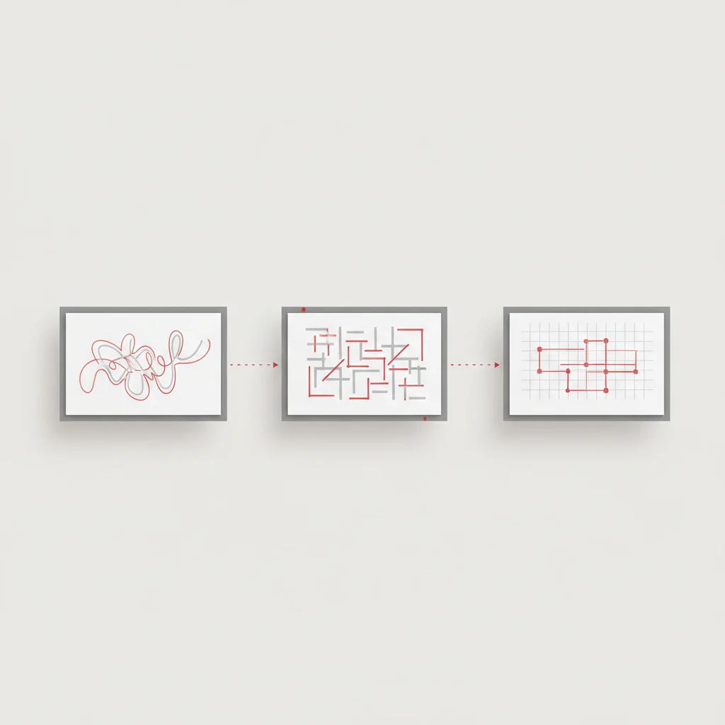
Designing an effective digital product requires moving past subjective opinions and relying on objective user research. Teams should utilize both qualitative and quantitative data to build highly accurate user personas. Quantitative metrics, such as traffic paths from Google Analytics 4, heatmaps from Hotjar or Microsoft Clarity, and drop-off points in transaction funnels, highlight what users are doing. Qualitative methods, including moderated user interviews and cognitive walkthroughs, explain why they behave that way.
Once collected, this research must be synthesized into functional user personas. These personas are not merely fictional profiles; they must represent actual target segments, complete with specific technological fluencies, accessibility requirements, and explicit goals. Aligning design decisions with these data-driven personas prevents "elastic user" bias—where the user's needs are subjectively redefined during design discussions to fit internal preferences.
Phase 2: Information Architecture (IA) and Journey Mapping
Information architecture forms the logical foundation of a digital experience. It dictates how content is classified, labeled, and structured across the product's site architecture. A robust site architecture ensures that users can locate desired information within a maximum of three to four logical actions. Teams utilize open and closed card sorting exercises with representative users to design intuitive navigation hierarchies that mirror the target audience's mental models.
Following the establishment of the information architecture, user journey mapping is employed to trace the end-to-end paths users take to complete key goals. These maps identify every touchpoint, user emotion, potential bottleneck, and technical system integration required along the path. By visualizing this flow, design teams can identify areas where users might experience frustration, allowing them to proactively simplify complex multi-step processes.
Phase 3: Intuitive Wireframing and Prototyping
With the structural blueprint finalized, the process moves into the prototyping phase. This step transitions abstract user flows into concrete interface structures. The process begins with low-fidelity wireframes that focus on layout, content prioritization, and functional elements without the distraction of colors, typography, or visual branding. This phase ensures that the fundamental interaction design is sound and that the visual hierarchy naturally guides the user's eye to primary actions.
[ User Research ] ──> [ Card Sorting ] ──> [ Low-Fidelity Wireframes ] ──> [ Interactive Prototype ]Once low-fidelity wireframes are validated, designers build interactive, high-fidelity prototypes in tools like Figma or Adobe XD. These prototypes mimic actual application behavior, including transition animations, modal overlays, and form validation states. High-fidelity prototypes are essential for realistic stakeholder reviews and provide development teams with unambiguous specifications for production implementation.
Phase 4: Usability Testing and Iteration
The final phase of the core UX cycle is usability testing. Before deploying any design changes to production, interactive prototypes must be tested with representative users. Testing should follow structured scripts designed around critical user tasks, such as completing a checkout or configuring an account setting. Observers record task success rates, error frequencies, and direct behavioral cues without intervening or leading the participant.
The insights gathered from these tests highlight subtle interface misunderstandings, label ambiguities, and workflow bottlenecks. Rather than treating design as a linear path, teams must establish an iterative cycle where testing feedback directly informs refinements in wireframes and prototypes. This continuous loop minimizes the risk of launching features that fail to meet real-world expectations.
Follow these sequential stages to establish a repeatable, high-quality design workflow. Gather quantitative user metrics and conduct qualitative interviews to define user needs. Organize content logically through card sorting to establish intuitive information structures. Create wireframes and interactive prototypes to validate user flows and layouts. Conduct usability tests with real users, analyze friction points, and iterate on the design.The Iterative UX Design Process
Research & Analysis
Architecture Design
Prototyping
Testing & Refinement
---
Technical Pillars of a Great User Experience
Optimizing Page Performance and Load Speed
A beautifully designed interface is ineffective if users abandon the site due to slow loading times. High performance is a core requirement for technical usability. Studies consistently demonstrate that page load delays directly increase bounce rates; a delay of even one second can reduce conversions by over 20%. Therefore, page performance optimization must be prioritized throughout both the design and development phases.
Designers can actively support performance by avoiding unnecessarily heavy visual elements. For example, replacing heavy, non-optimized image files with modern formats like WebP or AVIF, utilizing vector-based SVG graphics for icons, and avoiding excessive web font variations significantly reduces the initial payload. Furthermore, design decisions should support code-level optimizations like lazy loading non-critical assets, prioritizing above-the-fold content rendering, and reducing heavy render-blocking JavaScript executions.
Core Web Vitals: Integrating Technical SEO with UX
Google's Core Web Vitals establish a direct relationship between technical user experience metrics and search engine optimization. These metrics measure actual user experience data collected in the field, tracking speed, responsiveness, and visual stability:
Largest Contentful Paint (LCP): Measures perceived loading performance by tracking when the main content of a page is likely loaded. To provide a good user experience, LCP must occur within 2.5 seconds of when the page first starts loading.
Interaction to Next Paint (INP): Evaluates overall page responsiveness by measuring the latency of all user interactions (clicks, taps, keyboard inputs) during their visit. An optimal user experience requires an INP of 200 milliseconds or less.
Cumulative Layout Shift (CLS): Measures visual stability by tracking unexpected layout shifts during the loading phase. Pages should maintain a CLS score of 0.1 or less.
When interfaces undergo layout shifts—such as when a banner image loads without defined dimensions and pushes down an active text block—users experience frustration and may perform accidental clicks. Ensuring that all media assets have explicit height and width dimensions in the code, and reserving fixed containers for dynamic advertisements, directly stabilizes CLS scores and improves overall technical usability.
Mobile-First Indexing and Cross-Device Consistency
With global web traffic predominantly originating from mobile devices, designing primarily for desktop screens is no longer viable. Mobile-first indexing requires search engines to evaluate the mobile version of a website as the primary source for content ranking and structural evaluation. Consequently, responsive behavior must be designed into every interface component from the beginning.
An adaptive layout should not merely scale down desktop elements; it must reorganize content priorities to fit smaller viewports. Tap targets must be designed with a minimum size of 48x48 CSS pixels to prevent accidental selections, and interactive controls must be separated by sufficient white space. Navigation structures should transition from horizontal menus to clear, easily accessible vertical drawers. Maintaining functional parity across mobile, tablet, and desktop viewports ensures that users receive a consistent, high-quality experience regardless of the device they choose.
---
Enforcing Accessibility: Designing for All Users
Why WCAG Compliance is a Corporate Imperative
Ensuring digital accessibility is a legal, ethical, and commercial necessity. Adhering to the Web Content Accessibility Guidelines (WCAG) 2.2 AA standards is essential for mitigating legal risks and avoiding costly compliance lawsuits, such as those associated with the Americans with Disabilities Act (ADA) in the United States and the European Accessibility Act (EAA) in Europe.
More importantly, digital accessibility guidelines expand a product's market reach to millions of users with permanent, temporary, or situational disabilities. By removing visual, auditory, motor, and cognitive barriers, companies can improve overall site usability. This focus on inclusive design signals corporate responsibility and helps build a loyal, diverse user base.
Key Accessibility Standards for Digital Products
Implementing WCAG standards requires a methodical design approach that addresses several key aspects of the user interface:
Visual Accessibility: Designers must maintain a minimum contrast ratio of 4.5:1 for standard body text and 3:1 for large text against their backgrounds. Color must never be used as the sole indicator of information or action; error states, interactive links, and data visualizations must include accompanying text labels, varied shapes, or distinct patterns.
Screen Reader Compatibility: Web layouts must use semantic HTML tags (@@CODE0@@, @@CODE1@@, @@CODE2@@, @@CODE3@@, @@CODE4@@) to help assistive technologies parse the page content logically. Every non-text asset must have detailed @@CODE5@@ text descriptions, and interactive elements must feature clear ARIA labels when visual text is insufficient.
Keyboard Navigation: Users must be able to navigate all interactive features using only a keyboard. This requires maintaining a visible, high-contrast focus indicator (such as an outline) and ensuring a logical tab sequence through form fields, navigation links, and action buttons.
Cognitive Accessibility: Complex workflows must be simplified using clear headings, descriptive form instructions, and real-time validation error alerts. Readability levels should be kept concise, avoiding jargon and convoluted phrasing to prevent cognitive overload.
---
Measuring Engagement and UX Success
Quantitative Metrics: Task Success Rate and Time on Task
An optimization strategy relies on precise KPI tracking. Teams should monitor quantitative usability metrics to gauge exactly how easily users can navigate an application. The primary metric to track is the Task Success Rate (TSR):
$$\text{TSR} = \left( \frac{\text{Completed Tasks}}{\text{Total Task Attempts}} \right) \times 100$$
A consistently low TSR indicates significant design friction or confusing instructions.
Additionally, Time on Task (ToT) measures the average duration a user spends to complete a specific action. While high engagement is often desirable on content-driven platforms, a high ToT on checkout forms, search filters, or dashboard configurations usually indicates that the interface is difficult to navigate. Decreasing the ToT for utility tasks while maintaining high task completion rates is a strong indicator of a streamlined interaction design.
Qualitative Metrics: Net Promoter Score (NPS) and CSAT
Quantitative metrics show user actions, but qualitative metrics reveal user sentiment. The Net Promoter Score (NPS) gauges long-term user loyalty by asking how likely users are to recommend the product to others. Customer Satisfaction (CSAT) surveys capture immediate feedback by asking users to rate their satisfaction with a specific action, such as resolving a support ticket or completing a transaction.
While NPS and CSAT offer high-level insights, they must be combined with standard usability metrics like the System Usability Scale (SUS). The SUS is a reliable, ten-item questionnaire that provides a standardized score from 0 to 100, indicating perceived ease of use. Evaluating both quantitative behavior and qualitative feedback gives organizations a complete, accurate picture of user satisfaction.
Establishing Continuous Monitoring Protocols
UX optimization is an ongoing process, not a one-time project. Organizations must establish monitoring protocols to continually track user engagement and identify performance issues. This involves integrating automated analytics trackers with qualitative session recording tools.
[ Session Recordings / Heatmaps ] ──> [ Detect Friction / Drop-offs ] ──> [ A/B Test Variations ] ──> [ Implement Optimization ]By regularly reviewing session recordings and dynamic heatmaps, teams can pinpoint unexpected behavioral friction, such as users repeatedly clicking unclickable design elements. Coupling these insights with structured A/B testing allows organizations to continuously evaluate interface variations, validating optimization efforts with objective user data before wide-scale deployment.
---
Common UX Pitfalls and How to Avoid Them
Designing Based on Assumptions Rather Than Data
One of the most expensive mistakes in product design is relying on internal assumptions instead of actual user data. Internal teams are often too close to their own products, leading to "false consensus bias"—the assumption that target users share the same tech-savviness, priorities, and habits as the creators.
When layouts are created without real-world research, products often ship with features that are difficult to find, poorly understood, or misaligned with actual user needs. Organizations can prevent this by requiring all major design changes to be backed by user research data, behavioral recordings, or usability testing.
Overcomplicating Intuitive Navigation Structures
In an effort to appear highly innovative, designers sometimes abandon established web conventions in favor of complex navigation layouts, such as hidden menus, non-standard scrolling behaviors, or elaborate hover effects. While these choices may seem visually impressive, they often lead to user confusion.
When users arrive at a website, they expect standard, intuitive layout patterns: a search bar near the top right, a prominent menu at the header, and clickable links that are easily identifiable. Deviating too far from these conventions increases cognitive load and slows down the user journey. Designers should focus on creating clean, intuitive interfaces where the visual hierarchy guides users naturally to their destinations without requiring them to relearn basic navigation.
---
Securing Long-Term Growth Through Strategic UX Design
Key Takeaways
Investing in a robust, high-performance user experience strategy is a direct path to sustainable business growth. Rather than treating design as a finishing touch, companies must integrate it into every stage of their product development lifecycle. By grounding design decisions in user research, maintaining strict WCAG accessibility compliance, and optimizing technical performance, organizations can significantly reduce bounce rates, boost conversions, and lower development costs.
Robust UX Strategy ──> High Performance & Accessibility ──> Increased Conversions & LoyaltyAs digital markets evolve, user expectations will continue to rise. Companies that prioritize user-centric design and commit to continuous optimization will be well-positioned to adapt, retain users, and secure a strong, long-term competitive advantage.
---
Frequently Asked Questions
What is the primary difference between UI and UX design?
UI design focuses on the visual and interactive elements of a product, such as color schemes, typography, and button layouts. UX design encompasses the entire user journey, focusing on research, information architecture, usability testing, and overall utility to ensure the product solves real problems efficiently.
How does page load speed impact user experience metrics?
Page load speed is a fundamental aspect of technical usability, where even a one-second delay can significantly increase bounce rates and reduce conversions. Users expect fast loading times, and optimizing page speed directly supports user engagement and aligns with search engine indexing requirements.
Why is WCAG compliance essential for modern web applications?
WCAG compliance ensures that your digital products are accessible to all individuals, including those with visual, auditory, motor, or cognitive disabilities. Additionally, meeting these guidelines helps mitigate legal risks under regulations like the Americans with Disabilities Act (ADA) and the European Accessibility Act (EAA).
How do Core Web Vitals influence overall search engine visibility?
Core Web Vitals measure actual user experience indicators like page loading speed (LCP), responsiveness (INP), and visual stability (CLS). Because search engines prioritize user experience, maintaining strong scores in these metrics directly improves organic search visibility and search engine optimization rankings.
What is the purpose of low-fidelity wireframes in prototyping?
Low-fidelity wireframes establish the basic structural layout and visual hierarchy of a page without the distraction of aesthetic design details. This allows design and development teams to quickly iterate on functional navigation flows and content placement early in the process.
How often should usability testing be conducted?
Usability testing should be conducted iteratively throughout the development lifecycle, starting with initial prototypes and continuing after major updates. Regularly testing with representative users helps teams catch and address usability bottlenecks before they are deployed to production.
What are the risks of designing without user research?
Designing without user research forces teams to rely on internal assumptions, often leading to products that do not fit user mental models. This can result in poor feature adoption, higher bounce rates, and expensive post-launch code modifications to resolve usability issues.
How can a business measure the overall financial return on UX design?
Organizations can measure the ROI of UX design by tracking specific metrics before and after redesigns, such as task success rates, customer acquisition costs, support ticket volume, and conversion rates. Higher conversion rates and reduced development rework costs are direct indicators of design success.