
The Technical Foundations of Responsive Design
Responsive design relies on technical pillars like CSS media queries, flexible grid layouts, and viewport meta tags to ensure interface adaptability and structural usability.

ON THIS PAGE
0% read
- Introduction: The Business and Technical Imperative of Adaptability
- Architectural Pillar 1: The Viewport Meta Tag Control
- Architectural Pillar 2: CSS Media Queries and Breakpoint Strategies
- Architectural Pillar 3: Fluid Grid Layouts and Relative Units
- Architectural Pillar 4: Flexible Media and Rendering Performance
- Adaptive vs. Responsive: A Technical Distinction
- Executive Summary and Compliance Checklist
Understanding The Technical Foundations of Responsive Design is essential for maintaining digital agility, operational efficiency, and a unified brand presence. This strategic blueprint moves far beyond surface-level aesthetics, addressing how code architecture, browser rendering pipelines, and viewport calculations interact to shape user experiences. By establishing a robust responsive foundation, enterprises can preserve interface adaptability, guarantee structural usability across diverse device landscapes, and systematically reduce long-term maintenance overhead. This guide dissects the core architectural pillars, performance considerations, and compliance checklists necessary to design, build, and sustain modern, scalable web platforms.
Introduction: The Business and Technical Imperative of Adaptability

Strategic Value of Device Consistency
In a digital landscape populated by thousands of unique screens, structural consistency directly impacts user retention and brand equity. When interfaces fragment, fail to scale, or behave unpredictably across viewports, user trust declines. Device consistency ensures that user journeys begun on mobile devices can conclude seamlessly on desktop environments without cognitive disruption or loss of context.
A unified codebase is the technical driver of this consistency. Maintaining separate, dedicated platforms for mobile and desktop environments splits development resources, multiplies maintenance costs, and introduces data synchronization risks. Utilizing a single responsive codebase means that backend APIs, tracking scripts, and business logic remain centralized. This engineering approach ensures that security patches, feature releases, and content updates propagate simultaneously to all users, regardless of how they access the platform.
Performance Impacts of Poor Design
Interface adaptability cannot succeed at the expense of rendering performance. Poorly engineered responsive layouts often rely on bloated stylesheets, redundant DOM elements, and giant image assets scaled down via client-side CSS. This technical debt directly harms Google’s Core Web Vitals, specifically degrading Largest Contentful Paint (LCP) and Interaction to Next Paint (INP). High asset weight and excessive document sizes delay the browser's ability to paint the critical rendering path, causing performance drops on low-end mobile hardware and cellular networks.
[Server Delivery] ➔ [DOM/CSSOM Construction] ➔ [Layout Stage] ➔ [Paint Phase] ➔ [Composite State]
                                                   ▲
                                                   │ (Relative units prevent calculation loops)
High-performance rendering relies on streamlined browser processes. If stylesheets force the layout engine to execute multiple recalculation loops, page rendering slows. When pages take longer than three seconds to load, search engines degrade rankings and abandonment rates spike. Enterprise platforms must treat performance optimization as a core component of layout construction, ensuring that styling rules do not block the browser's rendering engine.
Structural Usability Beyond Aesthetics
Structural usability ensures that users can read, navigate, and interact with a website regardless of screen dimensions. True accessibility is built on logical content flow and predictable navigation, rather than subjective stylistic choices. Laying out content in a responsive interface requires careful attention to spatial hierarchy, so that critical calls-to-action (CTAs) remain visible and accessible without forcing users to scroll excessively or zoom manually.
/* Ensuring interactive elements meet minimum touch guidelines */
.primary-navigation-link,
.interactive-action-button {
  min-width: 48px;
  min-height: 48px;
  display: inline-flex;
  align-items: center;
  justify-content: center;
}
To maintain structural usability, designs must align with Web Content Accessibility Guidelines (WCAG 2.2). This compliance includes ensuring that interactive components are easy to target with touch controls. Touch targets must be at least 48x48 CSS pixels in size, with sufficient spacing to prevent accidental activations. When elements are placed too close together, touch accuracy drops, leading to user errors and lower conversion rates.
Architectural Pillar 1: The Viewport Meta Tag Control

Instructing the Browser Rendering Engine
The browser viewport represents the visible area of a web document. In the early days of mobile internet browsing, screen dimensions were small compared to desktop monitors. To display desktop-oriented layouts, mobile browsers rendered pages within a broad, virtual canvas—usually set to a default width of 980 pixels—and then scaled the output down to fit physical screens. While this kept layouts intact, it rendered text microscopic and forced users to pinch and zoom to read content.
The introduction of the viewport meta tag changed this behavior by allowing developers to control viewport sizing directly. This tag, placed within the <head> block of an HTML document, instructs the rendering engine on how to scale the layout. By setting the viewport parameters, developers can align the layout width with the actual width of the device screen, ensuring that content renders at legible sizes right away.
<!-- The industry-standard responsive viewport declaration -->
<meta name="viewport" content="width=device-width, initial-scale=1.0">
This simple line of code tells the browser's layout engine to match the page's width to the physical width of the device in device-independent pixels (DIPs). The initial-scale=1.0 directive establishes a one-to-one relationship between CSS pixels and device-independent pixels, preventing browsers from executing automatic scaling routines. This setup ensures that the layout grid begins calculations relative to actual screen sizes.
Device-Width vs. Fixed Dimensions Risks
Configuring fixed dimensions within viewport tags introduces significant technical risks. Setting a static layout width—such as <meta name="viewport" content="width=1024">—forces small mobile screens to compress the viewport. This results in clipped text, horizontal scrolling, and broken design components, which directly harm mobile usability and search engine visibility.
Fixed Width (e.g., 1024px)   ➔   Clipped bounds, horizontal scrollbars, broken layout.
Device-Width Dynamic Scale   ➔   Fluid containers, adaptive wrapping, clean interface.
Conversely, restricting user zoom functions to preserve a specific design layout creates accessibility issues. Viewport properties like @@CODE0@@ or @@CODE1@@ block the user’s ability to resize text manually. This violates WCAG 2.2 Success Criterion 1.4.4, which mandates that web pages must support text resizing up to 200% without breaking page features.
To ensure clean rendering and broad accessibility, developers should use fluid media queries for scaling and avoid disabling native browser zoom controls.
Architectural Pillar 2: CSS Media Queries and Breakpoint Strategies

Conditional Styling Logic
CSS media queries allow modern web pages to adjust their styles dynamically based on the characteristics of the target device. Introduced in CSS3, this technical feature lets developers write conditional style sheets that apply rules only when specific parameters are met. The rendering engine checks these conditions—such as viewport width, orientation, and resolution—and applies matching style rules to the DOM elements.
/* Base styles apply to all screens (mobile-first paradigm) */
.content-card {
  width: 100%;
  padding: 1rem;
}

/* Medium device styling enhancement applied conditionally */
@media screen and (min-width: 48em) {
  .content-card {
    width: 50%;
    padding: 1.5rem;
  }
}
During document parsing, the browser builds the CSS Object Model (CSSOM). When it encounters media queries, it registers them as conditional rules. If the current browser environment matches the query's criteria, the engine activates those style rules. To optimize initial page loads, developers can split media queries into separate files and reference them via standard HTML link elements.
<!-- Non-blocking style assets downloaded with lower network priority -->
<link rel="stylesheet" href="desktop.css" media="screen and (min-width: 64em)">
This arrangement instructs the browser to download the desktop styles with a lower priority on mobile devices. This prevents desktop-specific styles from blocking the initial render of mobile screens, helping optimize Largest Contentful Paint (LCP) times.
The Mobile-First Engineering Approach
The mobile-first engineering approach builds and optimizes web interfaces for small-screen devices before progressively layering on styles for larger displays. Historically, developers designed desktop layouts first and used media queries with max-width properties to shrink or rearrange components for mobile screens. This approach often resulted in complex, bloated stylesheets where mobile devices had to download and parse large amounts of desktop code only to override it immediately.
[Mobile Base CSS] ➔ Progressive Enhancement (min-width) ➔ [Desktop Complex CSS]Starting with mobile styles first uses min-width queries to progressively add layout complexity as screen real estate increases. This structure keeps base styles lean, ensuring that lower-powered mobile devices execute less CSS parsing.
This approach minimizes stylesheet complexity, avoids CSS specificity conflicts, and improves rendering speed across mobile devices.
Avoiding Device-Specific Breakpoints
A common mistake in responsive web development is building media query breakpoints around specific smartphone or tablet models. Because consumer technology changes rapidly, designing layouts around fixed hardware widths leads to fragile code that breaks on newer devices.
Device-Specific (Fragile):  320px (iPhone SE) -> 390px (iPhone 15) -> 430px (Pro Max)
Content-Driven (Resilient): 30em (XS Wrap) -> 48em (MD Column Split) -> 64em (LG Desktop Grid)
Instead of targeting specific devices, developers should use content-driven breakpoints. This technique involves resizing the browser window during testing and adding a breakpoint only when the content's layout begins to break or look unreadable.
Using relative units like @@CODE0@@ instead of absolute @@CODE1@@ for media queries ensures that breakpoints adapt to the user's default browser font settings, making the interface more future-proof and accessible.
Architectural Pillar 3: Fluid Grid Layouts and Relative Units

Shifting from Absolute Positioning
Fixed-width web layouts rely on absolute values like pixels to position page elements. While this approach gives developers precise control over visual placement in specific testing environments, it fails on different screen sizes. Fixed elements cannot scale dynamically, which leads to layout breakage, overlapping text, or massive whitespace gaps on larger displays.
[Pixel-based Containers (Rigid)] ➔ Forced overflows, text clipping, and empty gutters.
[Relative Sizing (Dynamic)]       ➔ Proportional adaptation across any viewport width.
To prevent these layout issues, modern responsive web design relies on relative units. Proportional units like percentages (@@CODE0@@), viewport width (@@CODE1@@), viewport height (@@CODE2@@), and font-relative values (@@CODE3@@/rem) allow elements to scale based on their parent containers or the browser's view window.
/* Establishing a flexible base typography framework */
html {
  font-size: 100%; /* Defaults to the browser user setting, typically 16px */
}

.body-copy {
  font-size: 1rem; /* Exactly matches the root context (16px) */
  line-height: 1.6;
}

.title-header {
  /* Fluid typography dynamically calculated based on viewport dimensions */
  font-size: clamp(1.5rem, 4vw + 1rem, 3rem);
}
This implementation of the clamp() function prevents sudden jumps at specific breakpoints by scaling typography smoothly as the viewport changes.
Using root-relative rem units ensures that typography and layout elements scale consistently and respect user-defined accessibility preferences.
Leveraging CSS Flexbox and Grid
Modern layouts rely on CSS Flexbox and CSS Grid to structure page content dynamically. Flexbox is designed for one-dimensional layouts, organizing items in either a single row or column. It excels at distributing space, aligning elements, and handling simple content wrapping within changing parent containers.
/* One-dimensional alignment with Flexbox */
.action-bar-container {
  display: flex;
  flex-wrap: wrap;
  justify-content: space-between;
  align-items: center;
  gap: 1.5rem;
}
For two-dimensional layouts, CSS Grid offers a robust system for managing rows and columns simultaneously. Grid allows developers to build complex, responsive page layouts without relying on nested divs or custom margin hacks.
/* Responsive columns using CSS Grid without media queries */
.article-listing-grid {
  display: grid;
  grid-template-columns: repeat(auto-fit, minmax(18.75rem, 1fr));
  gap: 2rem;
}
The repeat(auto-fit, minmax(...)) rule automatically creates columns that expand and wrap based on the container’s width.
This technique eliminates the need for numerous media queries, resulting in cleaner code and more predictable rendering.
Mitigating Cumulative Layout Shift (CLS)
Cumulative Layout Shift (CLS) is a core web performance metric that tracks how much page content shifts unexpectedly during loading. Large layout shifts lead to a poor user experience and can lower search rankings. In fluid layouts, CLS often occurs when the browser rendering engine has to recalculate and shift layout elements after flexible images and media files finish loading.
[Asset Lacks Dimensions] ➔ Height is initially calculated at 0px ➔ Content jumps down when loaded (CLS).
[Declared Aspect-Ratio]   ➔ Space is reserved in advance     ➔ Smooth page loading with no shifts.
To prevent layout shifts, developers must define the size of media elements in the DOM before they load. This is done by setting explicit height and width attributes or by using the CSS aspect-ratio property.
/* Reserving container space during initial layout pass */
.responsive-media-container {
  width: 100%;
  aspect-ratio: 16 / 9;
  object-fit: cover;
}
This rule ensures the browser reserves the correct aspect-ratio container space during the initial page layout pass, preventing unexpected content jumps as media assets load.
Architectural Pillar 4: Flexible Media and Rendering Performance

Maintaining Media Structural Integrity
Images and video files are inherently static assets with fixed pixel dimensions. In fluid grid layouts, these assets will overflow their parent containers if the screen is too small, breaking the layout. To prevent this, developers can use a simple CSS rule to keep media responsive:
/* Ensuring media files scale down to fit fluid containers */
img, video, embed {
  max-width: 100%;
  height: auto;
}
This rule limits an image’s width to the width of its parent container while scaling its height proportionally, preserving the original aspect ratio.
While this prevents layout breakage, downloading a high-resolution, desktop-sized image on a mobile screen wastes mobile bandwidth and processing power. To maintain fast load times, websites must serve sized-optimized media files based on the user's device.
Resolution Shifting with Srcset
Resolution shifting dynamically serves different image sizes depending on the user's screen capabilities. Instead of forcing all devices to download the largest image, the HTML5 @@CODE0@@ and @@CODE1@@ attributes provide the browser with a list of available image files and their physical widths.
<!-- Native resolution shifting configuration -->
<img src="fallback-image-800.jpg"
     srcset="optimized-image-400.webp 400w,
             optimized-image-800.webp 800w,
             optimized-image-1200.webp 1200w"
     sizes="(max-width: 30em) 100vw,
            (max-width: 60em) 50vw,
            1200px"
     alt="Dynamic dashboard preview showing interface layouts"
     loading="lazy">
Using this markup, the browser checks the viewport width and device pixel density, consults the sizes layout hints, and downloads only the most appropriate image asset. This native browser feature cuts down on unnecessary bandwidth usage, reduces data costs for users, and speeds up page load times on mobile devices.
For situations requiring actual layout changes (such as displaying a tight vertical crop on mobile instead of a wide panoramic image), the HTML <picture> element provides precise art-direction capabilities.
<!-- Art direction implementation for varied displays -->
<picture>
  <source media="(min-width: 48em)" srcset="panoramic-view.webp" type="image/webp">
  <source media="(min-width: 30em)" srcset="square-cropped.webp" type="image/webp">
  <img src="portrait-fallback.jpg" alt="Strategic execution schema" loading="lazy">
</picture>
Using modern image formats like AVIF or WebP through the <picture> element allows platforms to serve highly compressed, high-quality images.
This reduces data payloads, improves page rendering performance, and ensures cross-browser compatibility.
Adaptive vs. Responsive: A Technical Distinction
Server-Side vs. Client-Side Adaption
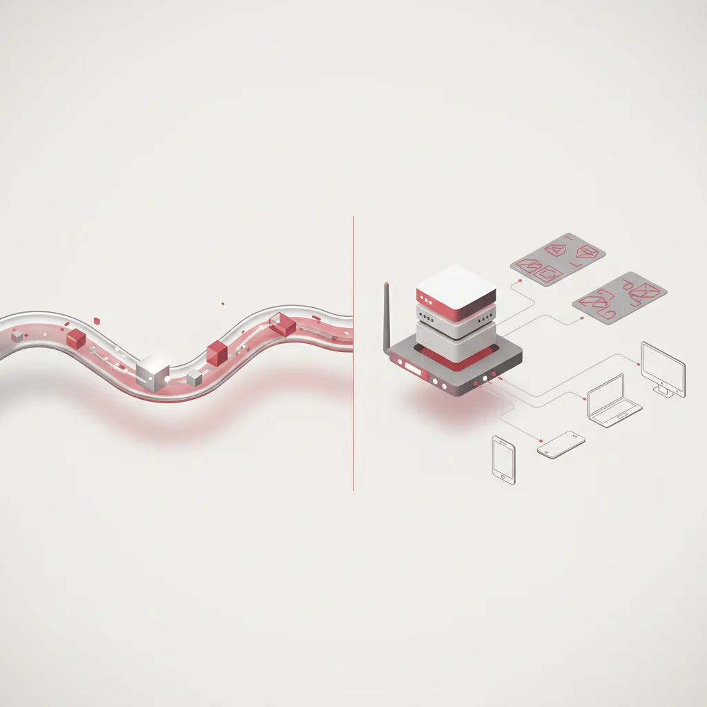
While responsive and adaptive design both aim to support multiple device types, they utilize different technical architectures. Responsive Web Design (RWD) uses a single HTML document that dynamically adjusts its layout client-side within the user's browser, using fluid grids and CSS media queries.
In contrast, Adaptive Web Design (AWD) detects device characteristics before rendering, serving pre-built static layouts. This detection can happen client-side via JavaScript or server-side by checking HTTP headers like User-Agent or Client Hints.
Responsive (RWD): Single HTML Codebase ➔ Client Browser ➔ Fluid Grid Scales Layout
Adaptive (AWD):   User-Agent Header   ➔ Web Server     ➔ Server Dispatches Custom Template
The server-side approach—often called RESS (Responsive Web Design with Server-Side Components)—allows websites to send tailored HTML and CSS payload packages designed for the specific request. This keeps the initial payload lightweight, but it increases server processing demands, complicates CDN caching configurations, and adds development overhead.
Static vs. Fluid Layout Architectures
Choosing between responsive and adaptive design affects development workflows, performance profiles, and long-term site maintenance. Responsive design’s unified codebase makes it highly scalable and easier to update over time, since changes apply to all device types simultaneously. However, responsive layouts require careful optimization to ensure that styling files and assets do not slow down lower-end mobile devices.
On the other hand, adaptive design allows developers to craft highly tailored, lightweight experiences for specific target hardware configurations. This can be useful for complex, transactional web portals or web applications with highly specialized workflows.
However, maintaining multiple separate templates increases development costs, requires ongoing updates as new devices launch, and complicates content management pipelines.
Strategic comparison to determine when to employ Responsive (RWD) versus Adaptive (AWD) design models. Avantaj Responsive Design requires only a single codebase, drastically reducing continuous development overhead. Dezavantaj Adaptive Design requires updating multiple device-specific templates when adding new features. Avantaj Responsive Design uses a single static HTML document, making it fully cacheable on edge CDN nodes global-wide. Dezavantaj Adaptive Design relies on User-Agent sniffing, complicating caching and requiring specialized server-side processing. Avantaj Responsive can achieve basic crops using HTML5 picture tags, keeping codebase complexity contained. Dezavantaj Adaptive excels at delivering entirely unique, simplified experiences for low-end mobile configurations.Architecture Comparison Matrix
Multi-Device Maintenance
Edge CDN Cacheability
Content Art Direction
Executive Summary and Compliance Checklist

Revisiting Core Technical Pillars
Building and maintaining high-performance responsive web platforms requires a structured, multi-layered approach. The viewport meta tag ensures that browser rendering engines align page widths with physical screen boundaries, establishing the foundation for responsive scaling. Fluid grids, combined with relative styling units like rem and modern layout systems like Flexbox and Grid, allow page elements to adapt proportionally across different device displays.
Conditional media queries progressively add design complexity for larger viewports, while keeping initial rendering speeds high on mobile devices. Flexible media strategies, including resolution shifting via srcset and explicit image dimensions, preserve layout stability and protect Core Web Vitals performance.
To ensure long-term stability and high performance, digital product managers, developers, and QA teams should run automated testing routines. This includes using tools like Cypress, Playwright, or Puppeteer to test layouts across different screen configurations and prevent layout issues.
Frequently Asked Questions
What is the primary technical difference between responsive and adaptive design?
Responsive design uses a single HTML document that dynamically adjusts to any screen size using fluid grids and CSS media queries. Adaptive design serves distinct, pre-built HTML templates depending on server-side or client-side detection of the user's device type.
Why is the viewport meta tag considered critical for responsive layouts?
Without the viewport meta tag, mobile browsers default to rendering pages inside a virtual desktop layout (typically 980 pixels wide) and then scale the entire page down, resulting in microscopic, unreadable text. Setting the viewport tag instructs the rendering engine to match the rendering canvas directly to the device's physical screen width.
How do relative CSS units like rem and em improve accessibility?
Relative units scale dynamically based on font size definitions. Using rem units ensures that if a user changes their browser's default font size for accessibility reasons, the entire layout and typography adjust proportionally, preventing overlapping text or layout breakage.
What is Cumulative Layout Shift (CLS) and how do relative layouts affect it?
Cumulative Layout Shift measures unexpected visual movement on a page during loading. In relative layouts, if image or video containers do not declare an aspect ratio or explicit dimensions, their heights default to zero until the asset loads, causing elements below to suddenly jump and damaging user experience.
When should developers use CSS Grid instead of CSS Flexbox?
Developers should use CSS Grid for complex, two-dimensional layouts involving both columns and rows where structural alignment is necessary in both directions. CSS Flexbox is best suited for one-dimensional layouts, aligning items along a single axis (row or column) with flexible sizes.
How does the srcset attribute improve page speed on mobile devices?
The srcset attribute provides a list of image file options in different physical widths. The browser calculates the screen's size and device pixel ratio, selects the most appropriately sized image, and downloads only that file, preventing mobile devices from wasting bandwidth on massive desktop assets.
Why should developers avoid hardcoding device-specific breakpoints?
Device landscapes change rapidly with new phone, tablet, and foldable screen dimensions launching constantly. Hardcoding breakpoints for specific models leads to high maintenance costs and layout failure on non-targeted screen sizes, whereas content-driven breakpoints adapt organically to any screen width.
What is the mobile-first CSS strategy and why is it recommended?
A mobile-first CSS strategy writes base styles for small screens without media queries, then progressively enhances the layout for larger viewports using min-width media queries. This results in leaner stylesheets, easier debugging, better rendering performance, and reduced selector specificity conflicts.